About Chad Kouri


Chad Kouri
Living and working in Chicago, IL
View CV
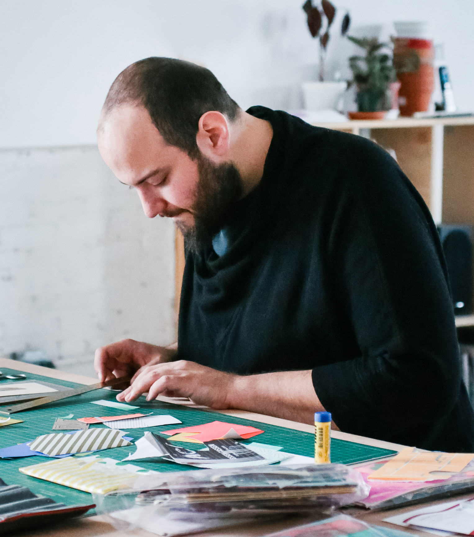
Chad Kouri is a Chicago-based working artist, musician, and cultural worker known for his intuitive, vibrant compositions that utilize the healing powers of improvisation, color, and abstraction. His multidisciplinary studio practice mirrors his mixed-race identity, focusing broadly on visual Art, music performance, and design while considering theories based on minimalism, color theory, semiotics, improvisation, radical joy, and community care. Utilizing a wide range of skills and strategies, Kouri reminds us to stay curious and make time for play, rest, and introspection, enabling us more bandwidth for personal and collective grounding, understanding, and empowerment.
His decade-long curatorial and collaborative efforts as a co-founder of The Post Family have played a significant role in creating a broader national and international dialog around Chicago and its world-class creative community. Previously, he has held the title of Art Director for the award-winning contemporary art magazine Proximity. Notable upcoming and past exhibitions and performances include displays at Subliminal Projects, Los Angeles; Hyde Park Art Center, Chicago; The Museum of Contemporary Art Chicago; The Rochester Museum of Fine Arts, New Hampshire; Purdue University; Mission Cultural Center of Latino Arts, San Francisco; Apexart, New York and the International Poster and Graphic Design Festival in Chaumont, France. Notable past appearances include visiting artist engagements at The School of the Art Institute Chicago, Glasgow School of Art, Portland State University, Otis College of Art and Design, Pratt University, and The Bauhaus University in Weimar, Germany. His projects range in diversity from one of a kind and editioned artwork to self-publishing, interactive displays, large-scale installations, design direction and consulting, book design and most recently, an exploration in music performance and composition.
Artist Statement
As a working artist, my broad studio practice is an investigation of visual literacy and semiotics—specifically how we think about, see, read, and remember the world around us. I believe Art is meant to be a conversation—a call and response between viewer and image—and not just depict a rigid thought or concept. Co-opting strategies and theories from marketing, advertising and color theory, my works act as cerebral playscapes, subconsciously prompting introspection while helping the viewer learn more about themselves and their surroundings. Using simple geometry and the psychology of color, I build ambiguous environments that align neural-pathways, allowing for self-exploration through memory and imagination. Over time I have come to appreciate the power of ambiguity in art, especially when juxtaposed against the overstimulated information-age we are currently living. I welcome the referential properties of abstraction as a means of creating a more harmonious relationship between the artwork and the viewer’s past experiences. By doing so, I hope to promote self-love, optimism, awareness, and acceptance in order to reveal shared experiences and empathy that transcends the social constructs of age, gender, and race.
Ultimately I want my work to operate as a vehicle for greater understanding of ourselves and the world around us, creating a dialog between viewer and artist that transcends color and shape. While considering these intentions, I continually push the limits of my practice, never confined by one single medium or mode and method of creation. As a result, my work is able to live in white cubes, city parks, modest apartments, museums, commercial spaces, private residences, dingy clubs, workspaces and dusty bookshelves around the world.
Website Notes and Considerations
The main purpose of this website is to make my practice as transparent as possible in order to give you a more informed viewing experience of my work. By providing you with cross-references, process images, related reading, influences and more, my goal is to create a deep reading experience. The yellow screen you see before entering my site is meant to act as a visual palette cleanser, instinctually providing a more engaged and deliberate viewing experience. The site is typeset in Roboto, a freeware font created and distributed by Google Fonts.
Please excuse any errors in written communication as I’m genetically predisposed to communicating better with images than words. Read more here.